


My Role
UX Researcher, UX Designer, UI Designer
Key Skills
User research (survey and interviews), ideation and design thinking, mid and high fidelity screens, prototyping, usability testing.
Tools

Timeframe
May - June 2022
Overview
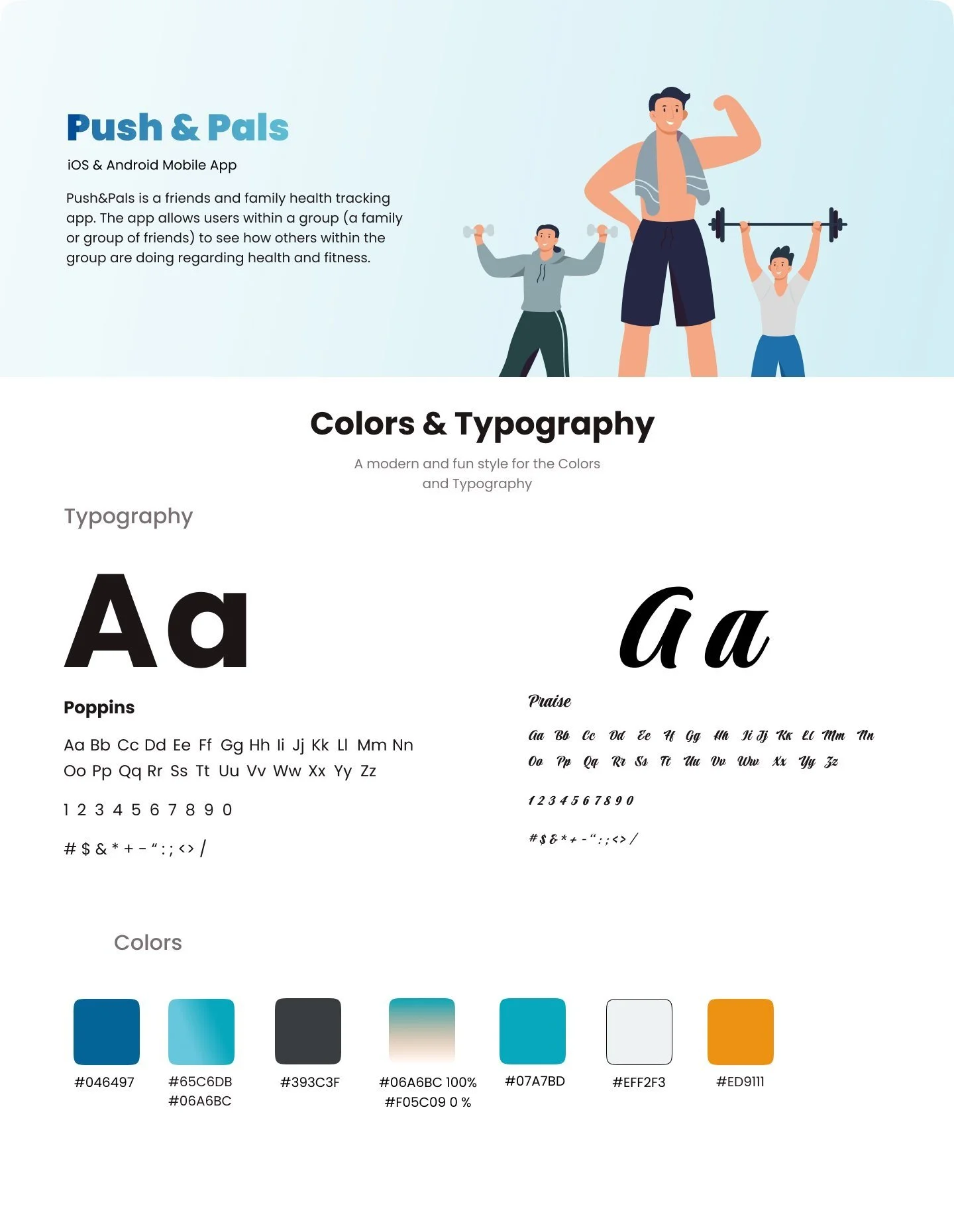
I received a brief about a fictitious well established company with an existing health and fitness tracking app for family and friends. The app allows users within a group or network to track how the people in their network are doing regarding health and fitness.
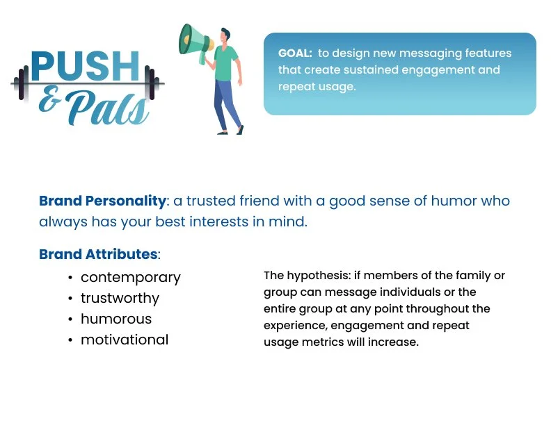
Based on the challenge brief provided, the company wanted to integrate a messaging feature into the app. The goal was to integrate messaging into existing features in order to increase repeat usage and engagement.

Problem
The design problem for this project was how to design and integrate messaging into features of an already existing health tracking app for family and friends in order to increase repeat usage and engagement.
Hypothesis
The hypothesis is that if members of the family or group can message individuals or the entire group at any point throughout the experience, engagement and repeat usage metrics will increase.
Solution
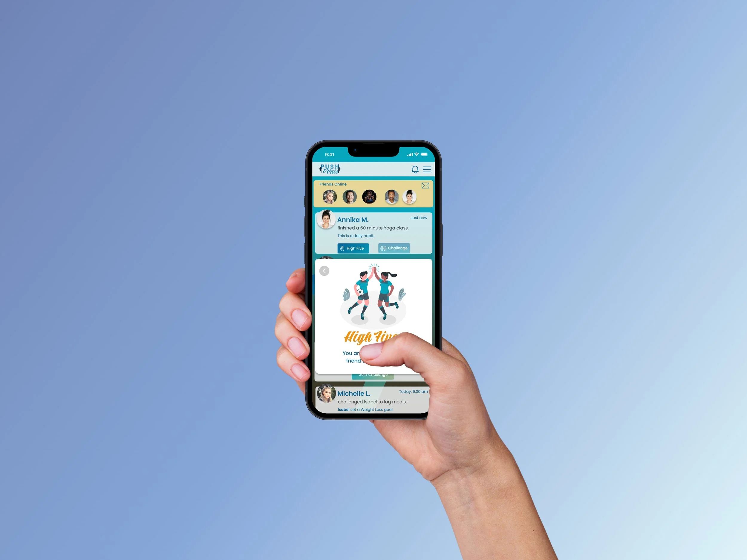
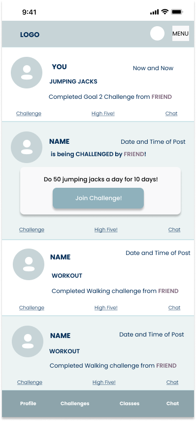
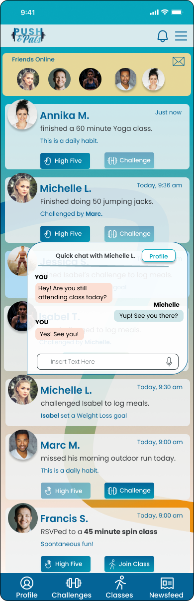
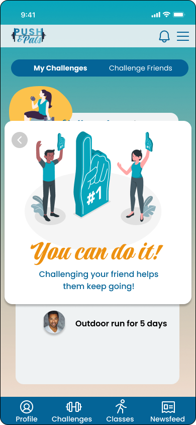
The solution I designed for this problem was to create a “quick message” pop up screen that was easily accessible for a short exchange between friends. To increase repeat usage and engagement, the app allowed users to challenge each other based on the goals that another user set for themselves. Users were also able to “high five” for wins or “challenge” for an encouraging nudge.
Research Process
User-Centered Design was applied throughout this design project.
I was provided with a brief to work with, and iterated on the “existing” app from there. My main goal was to find out whether a messaging feature was necessary for a family and friends fitness app and how to integrate that without just adding a chat function.
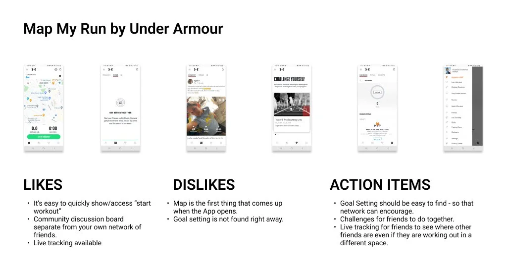
Competitive Analysis
I started by running a competitive analysis to be able to see how other fitness apps work, and if they have any engagement features offered. I noted down the things that I liked, didn’t like, and what I could do to improve the app to add to our existing product.


Primary Research
To begin my primary research, I conducted a survey that was sent out to various social media groups. The survey received 45 responses. I focused on 5 people to interview that aligned with the description of the target users for the app to research further.
Summary of Findings
Based on my surveys and interviews, it was pretty clear that a messaging feature was not the priority for many of the users. Naturally, I would discuss these findings with the project manager to see how they would like to proceed. For this process, I continued to work, and figured out how to make interaction in the app among a network of people more appealing and enjoyable.
Constant engagement through the app while working out is not very necessary for most (75%) of the survey participants BUT 50% of the participants share that some engagement keeps them motivated to continue working out and tracking their goals


Personas


Insights
Based on my research, users weren’t keen on using a messaging feature on a health tracking app. However, some engagement within the features of the app could be something that they would use to keep up with their fitness routines.
Messaging would take too long when the priority of the app would be to track progress and fitness levels.
Engaging with friends and sharing goals can be a motivating factor in health and fitness.
How Might We
How might we integrate messaging into existing features that wouldn’t require opening another screen?
How might we allow users to engage with one another without requiring too much time on the app?
Design Process
After thinking through the research and brainstorming various ideas, I came up with a plan to allow users to engage with each other through encouragement and challenges. I also added a feature in the app where users can see who among their friends are registered on certain classes that they might be interested in taking with them. Lastly, I added a quick chat pop up feature that allowed a user to simply click on their friend’s photo to send a short and quick message.
Site Map

This was the initial site map that I worked on before I worked on my mid-fi screens. There were several changes made based on the usability testing results.
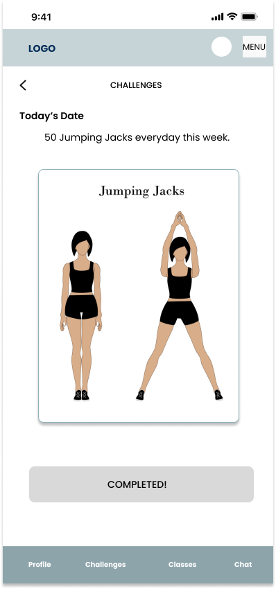
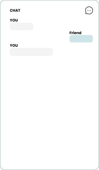
Low to Mid Fidelity Screens


Usability Testing
Findings
I did a usability testing session with 5 participants with my low to mid fidelity screens and found the following issues:
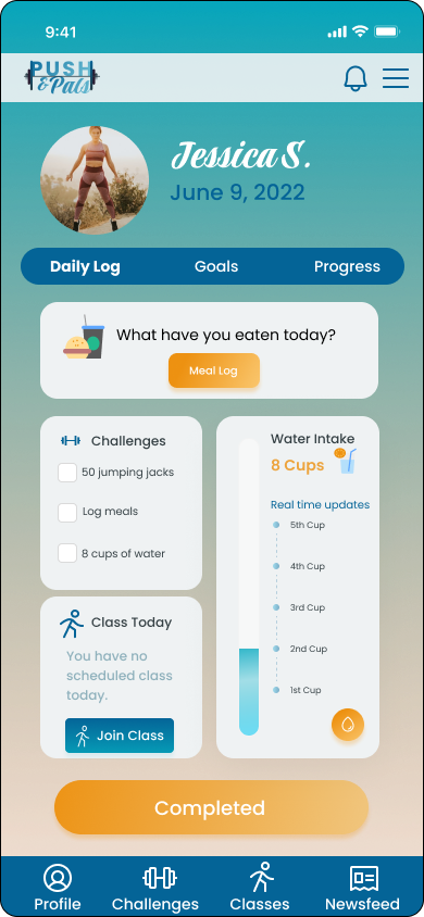
Profile was preferred to be the first screen for purposes of motivation. Newsfeed is just secondary.
UI issue - There was no text box in the chat section.
Too many screens before reaching end goal.
Iterations
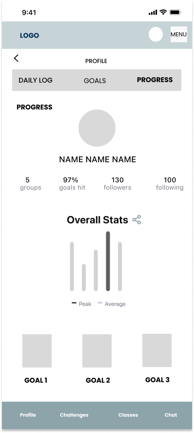
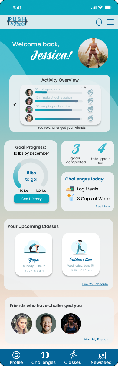
I created a dashboard for the landing page when the user logs in to be able to see their stats and progress first.
Chat became part of any screen by simply clicking on another user’s photo - this solved too many clicks as well as quick accessibility without having to leave their page.
The newsfeed became just a part of the menu page if the user wanted to see what their friends were up to and if they chose to engage with anyone else.
Design System
I downloaded a UI kit to help me put together a design system for the app. This helped guide my process from shifting the mid fidelity screens into high fidelity screens.
High Fidelity Screens

Learnings and Future Steps
Future Steps
As this was only a 90 hour project, there are a few things I would do if I had more time:
Do another usability test with the high fidelity screens, and iterate.
Add the functions to allow friends to invite other friends to classes.
Create groups to discuss things together without leaving their screens.
Add workout functions like a timer, calendar, map (for showing distance and routes) with ways to engage with friends.
Add a feature where users can see who of their friends are currently working out.
Learnings
There will be times that your research doesn’t agree with the project you are assigned to - you can find creative ways around it, or discuss with the project manager how to move forward.
I learned how to do gradients and overlays on Figma.
Taking note of the target audience provided will help with limiting your survey and interview screenings.